why?

Gizo

New Member
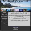
ok I have a page for my caravan park designed in live view and preview it looks good, when I look at it in design view the navigation bar jumps down? I am using dreamweaver cs5.
it looks fine a browser and live view, but in the design view ti looks a bit confusing? why would it do this?
I am coding this site manually and not in design view.
 

Attachments

  • screen print 1.jpg
    screen print 1.jpg
    59.9 KB · Views: 33
  • screen print 2.jpg
    screen print 2.jpg
    85.4 KB · Views: 31
Last edited:

d a v e

New Member
because DW preview isn't perfect? it's a bit of a mish mash and as long as it's fine in browsers then don't worry ;)

you could make your right panels slightly narrower if that helps (click and drag the left side)
 

ronaldroe

Super Moderator
Staff member
My guess would be that the blue borders Dw adds in design view are making the menu items too wide.
 

Gizo

New Member
thanks guys,

I have added an id of navbuttons to each of the buttons and reduced the width by 1px using css and it now looks fine.

I would like to get some feedback on this site if possible, this is my first attempt at design and producing a website. I saw the website review topics but I do not have anywhere to publish this site yet.:confused:

I am also working on another site which will be published before this one which will be on fly tying.

as I am learning at this stage I will tear down and rebuild a few times before I am ready, this is all just learning for me:D
 

DHDdirect

New Member
I'd also validate your code using the following links (pages must be live). Many times code can display correctly but not in all browsers with one of those browsers being Dreamweaver.

Code:
[URL]http://validator.w3.org[/URL]
[URL]http://jigsaw.w3.org/css-validator[/URL]

But I also agree with dave ;-)
 

Gizo

New Member
here is my site (hope this displays correctly) I will pu it in the reviews section as well.
 

Attachments

  • mockup.jpg
    mockup.jpg
    89.1 KB · Views: 26

ronaldroe

Super Moderator
Staff member
Not a bad site. Couple of things I'd look at:

Different font for the header. Something a little more scripty.

Add some padding to the left and right of the content area.

On the row of images, it might look a little better to make the left and right-most borders the same width as the rest of the borders.

Still, not a bad layout.
 
Top