TUTORIAL: Using Floats (Floating Divs)

Status
Not open for further replies.

PixelPusher

Super Moderator
Staff member
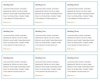
Several people have inquired about how to correctly use floats (e.g. How to float divs with in divs on a page).

The code below show a simple layout for floating three divs inside a container.
**Please note this layout is not limited to divs, floats can be used with a wide variety of page elements (P, UL, A, IMG, etc.)

Enjoy. PM me if you have any questions.

HTML
HTML:
<div class="container">
	<div>
    	<h2>Heading One</h2>
        <p>Lorem ipsum dolor sit amet, consectetur adipiscing elit. Nulla id nunc lacus. Integer bibendum varius fringilla. Suspendisse potenti. Donec nec tincidunt tellus. Curabitur fringilla viverra placerat. Sed quis turpis nunc.</p>
        <a href="">Read more &rarr;</a>
    </div>
    <div>
    	<h2>Heading Two</h2>
        <p>Lorem ipsum dolor sit amet, consectetur adipiscing elit. Nulla id nunc lacus. Integer bibendum varius fringilla. Suspendisse potenti. Donec nec tincidunt tellus. Curabitur fringilla viverra placerat. Sed quis turpis nunc.</p>
        <a href="">Read more &rarr;</a>
    </div>
    <div>
    	<h2>Heading Three</h2>
        <p>Lorem ipsum dolor sit amet, consectetur adipiscing elit. Nulla id nunc lacus. Integer bibendum varius fringilla. Suspendisse potenti. Donec nec tincidunt tellus. Curabitur fringilla viverra placerat. Sed quis turpis nunc.</p>
        <a href="">Read more &rarr;</a>
    </div>
</div>

CSS
Code:
div.container {
	margin:20px auto;
	border:solid 1px #ccc;
	width:790px;
	overflow:hidden;
	position:relative;
}
div.container div {
	float:left;
	margin:1px 0 1px 1px;
	border:solid 1px #069;
	width:260px;
	height:193px;
}
div.container h2, div.container p, div.container a {
	font-family:Arial, Helvetica, sans-serif;
	font-size:8pt;
	color:#444;
	padding:0 10px;
}
div.container h2 {
	font-size:10pt;
	line-height:25px;
}
div.container p {
	line-height:15pt;
}
div.container a {
	display:inline-block;
	line-height:17pt;
	color:#C60;
	text-decoration:none;
}
div.container a:hover {
	text-decoration:underline;
}
 

Attachments

  • forum_tut.jpg
    forum_tut.jpg
    19 KB · Views: 1,117

lynx

New Member
this code is nice and clean but i'm still a bit of a noob so i gotta ask: your second class declaration

Code:
div.container div {
	float:left;
	margin:1px 0 1px 1px;
	border:solid 1px #069;
	width:260px;
	height:193px;
}

am i understanding this correctly if i say you're defining how to handle divs that are nested within divs? and will this work for any level of nesting?

i assumed this because you only use class=container once in each div

also, since the main reason i read this was because i was trying to nest divs and align them differently from just having each under the other, which part exactly is it that allows the nested divs to appear next to each other instead of right under each other? i'm assuming it has to do with an interaction between align, setting the dimensions to be exact and maybe with overflow and position - but i'm not sure about it.
 

PixelPusher

Super Moderator
Staff member
this code is nice and clean but i'm still a bit of a noob so i gotta ask: your second class declaration

Code:
div.container div {
	float:left;
	margin:1px 0 1px 1px;
	border:solid 1px #069;
	width:260px;
	height:193px;
}

am i understanding this correctly if i say you're defining how to handle divs that are nested within divs? and will this work for any level of nesting?

i assumed this because you only use class=container once in each div

also, since the main reason i read this was because i was trying to nest divs and align them differently from just having each under the other, which part exactly is it that allows the nested divs to appear next to each other instead of right under each other? i'm assuming it has to do with an interaction between align, setting the dimensions to be exact and maybe with overflow and position - but i'm not sure about it.

Lynx,

In response to your first question, yes I am defining styles for all divs that are children of (nested inside of at any level) the the div element "container".

Second question...to get the divs to stack next to each other as opposed to one under another, I used a float. The float property has two options, left or right. Any element with a float will move to the far left or right edge of it parent (containing element). By default floats will stack up next to each other like books on a shelf. When the space on the first line is filled it will automatically start a new line under the first.

Thing to note if you use floats, do the math. For fitting elements on one line, you want to divide the number of elements by the width of the parent element (container).
 

lynx

New Member
Thanks! that clears everything up - i was trying to figure it out by checking the source on another templated page i made but i couldn't figure it out

Thing to note if you use floats, do the math. For fitting elements on one line, you want to divide the number of elements by the width of the parent element (container).

or i can use percentages right? thats how the source i looked at worked. i'd rather use percentages because it would make it more flexible, depending on the design ofcourse.

thanks again - this was a big roadblock for me
 

PixelPusher

Super Moderator
Staff member
Thanks! that clears everything up - i was trying to figure it out by checking the source on another templated page i made but i couldn't figure it out


or i can use percentages right? thats how the source i looked at worked. i'd rather use percentages because it would make it more flexible, depending on the design ofcourse.

thanks again - this was a big roadblock for me


For sure, percentages will also work. Glad I could help.
 

leroy30

New Member
I very much dislike floats. They upset the order of things if you ask me!

I prefer to stick to display:inline where possible because it means I get the 'floating' effect on my divs but they still expand the container they are sitting in. With float you have to manually adjust the height and it makes things difficult for liquid layouts i.e. mobile-friendly layouts.
 

leroy30

New Member
Actually on that note there's a number of things I do in my css for every page that makes my life a lot easier. Heres one that might help you out.

div {display:inline;*display:inline-block;zoom:1;position:relative;}

Obviously it isn't always the way forward but a lot of beginners, at least, will find things easier after applying that style.
 

Phreaddee

Super Moderator
Staff member
Well unlike leroy i love floats, and i think they actually simplify layouts.
Apply position:relative, display:inline, float:left/right.
No setting heights, or any of those issues mentioned.
No ie bugs either...
 

lexy

New Member
div {display:inline;*display:inline-block;zoom:1;position:relative;}

Thanks, that did the trick for me. I have always been struggling with floating layouts and had to work it out by trial and error. Your code seems to clear many bugs away.
 

deyb

New Member
I very much dislike floats. They upset the order of things if you ask me!

I prefer to stick to display:inline where possible because it means I get the 'floating' effect on my divs but they still expand the container they are sitting in. With float you have to manually adjust the height and it makes things difficult for liquid layouts i.e. mobile-friendly layouts.

Floats are great if you use in properly and not over do it. There are lots of objects you can float like, login form, social media share, subscription forms, etc.
 

lionel.web

Member
I didnt executed the html/css, but for the one that asks for ie.
I know that in old ie (IE<9), display:inline-block, doesnt work.
You have to add a little css hack.

display:inline-block; *display:inline; zoom:1

That will do the trick for old IE, and display:inline-block
 

ronaldroe

Super Moderator
Staff member
The idea is to use inline-block in place of floats. Because inline-block takes up height and width as defined, like a block element, but not the entire line, as in inline, the nav elements (assuming that's what you're talking about) will sit next to one another.

I've found that the project really determines which I use. I find inline-block is easier to control and manipulate, but floats are better when you want fluidity (is that a word?).
 

Edge

Member
I've never really liked floated elements as they take an element out of the flow and then I have to do something else to make them behave as if they were in the flow. That said, they are the best option for stacking columns when you want each column to have the same width and not get affected by what's inside it. I like using inline-block on horizontal navigation elements and other elements you want to stack horizontally where width can vary.
 
Status
Not open for further replies.
Top