please review

reverseengineer

New Member
I think the background is distracting, the logo is hard to read, and the colors don't match. But the functionality is good. It's a great idea, good luck and keep working hard!!!
 

sisqology

New Member
thank you very much, i'm still a learner and i am eager to keep learning, do u mean i should change the color of the logo also? Or i should just enlarge a bit??
 

d a v e

New Member
simplfy the logo

left align the text (not full jsutified)

take the date and time away from the top :(
counter eeuww.
site looks dated
 

brandontw

New Member
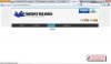
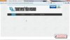
Sorry to be harsh, but for being a web designer's site, its not that convincing that you know what your doing.

1. get rid of the "back to top" button. you page is short enough to fit in most windows, and even if it was longer, people know how to scroll. And besides that, you might want to design all your pages to be short, so that people dont even have to scroll. Plus, it looks tacky.

2. Ditch the little pictures next to your headings like the "i" next to ||ABOUT TT DESIGNS and the shopping cart next to ||SERVICES. The are just unnecessary, and look unprofessional.

3. Logo is pretty crazy. tone it down a bit?

4. Colors are mismatched an unexciting, and the background is distracting.

5. Fonts on welcome to tt designs, and special offer are strange, and too bright.

6. Portfolio link is empty... obviously.

7. There is absolutely nothing on the site that proves to me that you actually offer the services you are offering:

in order:
VALID XHTML- yours doesnt validate
CSS- your css is basic and unimpressive, even from a beginners standpoint(like me)
JAVASCRIPT- does your page even use javascript? other than jquery and your timestamp?
JQUERY- you implemented a lavalamp nav plugin, which is fine, but its hardly an impressive demonstration of your immense jquery prowess.
PHP-?
CUSTOM GRAPHICS DESIGN- As i said, im no expert at all, but i personally dont care for the graphic design on your site much at all. you should look at a lot of site(some great ones have even been posted in this forum recently) and take some inspiration from them.
LOGO DESIGN- I think your logo is ok, but it doesnt really posess any of the elements of a good logo like:
-Describable
-Memorable
-Effective without color
-Scale-able
-Relevant to the application

I might do someting like a variation on just "TT" and then write in plain font below it "TemiTopsy designs"

8. Favicon... what is that? i cant see it... is that a small version of your logo?:confused:

9. Your english, punctuation, ect... I understand that its probably your second language, but if your serious about having a business or whatever based in english, you should figure out a way to clean up the wording on your website. For a native english speaker its obviously broken english. If your serious about it I'd be happy to help you make it more proper.

Anyway, thats all for now. Sorry if i seem harsh, but i really am trying to help. And im serious about helping you out with the wording if you need it. Just let me know and ill fix it up and post it on here for you to use.

good luck!

-Brandon
 

sisqology

New Member
Thanks people, for commenting, i really appreciate, i dont let things like this get me down as i am just still a learner, but your comments will make me work hard and definitely let me know that i still have some way to go, and thanks for your detailed info, brandon.. Its really nice to hear from people like you. So, how will you help me? I am still willing to learn more and more, so if there's anyone out there willing to tutor, i will be very glad. Though,its so annoying and i wanna be determined and be focused because i know i have the strength to get there.
 

krymson

Member
I'm going to have to agree with brandon. I'm not going ti lie, i was expecting to see the site done in tables when i looked at the site, it looks like something made in the late 90's. The nav is nice but that's really about it, the background is really distracting blinking text is seriously old im surprised its not depreciated yet. The counter is terrible. The list goes on and one. If i were you i would look around the internet and get some inspiriation. All i can say bro is learn, become a sponge and absorb. dont sell services yet, build things recreationally and learn from everything, build up a portfolio and THEN start building stuff professionally.
 

brandontw

New Member
Im just a beginner myself, so im really not in any position to offer detailed advice or tutoring when it comes to the actual web development. Ive only built one site in my life, and im still only about 60% satisfied with it.

But what i can do is help you make sure your English is good, and that your wording sounds proper and professional. Im not gonna write if for you, but i can rearrange your stuff slightly so that it sounds right.

All i can say on the design and development for now is start simple; strip down your design to the bare minimum, at least at first... get rid of all your images, including your background images, and go simple. And pick some modern colors (only one or two!) and some modern typefaces.

And look at inspiration! A google search for "portfolio websites" returns this as the second result... http://designm.ag/inspiration/101-awesome-portfolio-sites/
 

d a v e

New Member
not sure what the logo is supposed to be - hair?

rollovers don't match the colour of the logo - use the same blue or a contrasting colour

take away the w3c badges - pretty pointles
 

Phreaddee

Super Moderator
Staff member
definately remove the w3c badges - 2 reasons

1. a client/customer does not give a shit about that
2. a web professional will laugh at you.

also that logo is nothing but a few lines, and like dave mentioned. it looks like hair.

once you've made your site, and it DOES validate. then maybe add your badges, but please, in the footer!!!
 

Phreaddee

Super Moderator
Staff member
hahaha!

dave is totally on the money there, although its SSS instead of SS.

i'd ditch the logo altogether, it is not needed.
and fonts! you need to not pidgeonhole yourself.
something that is relevant, and timeless. not something trendy or in fashion now, because in a few years, even months it will look dated. it has to flow on and fit with your entire site, and perhaps it be wise for you to design the rest of the site and build it before concentrating so hard on the header. and the social media things, my god, just the simple, minimal, and very much recognised [f] [t] etc.
simple clean design. simple clean font, simple clean logo.

dont try to over do it, dont try to make it too fancy, just make it right!
 
Top