Help w/ (probably dumb) CSS Problem

alexsmith0913

New Member
First of all, this is my first post, so take it easy on me if I do something wrong :)

Onto the problem...

I'm trying to center my CSS navigation menu. I'm probably making a completely moronic mistake, but I've been trying to figure this out for quite some time now to no avail. I've managed to ALMOST do it, but there's something wrong, and it's probably something minor.

(Please excuse the sloppy coding; I'm just beginning to design the layout)

HTML:
HTML:
  <div id="navigation">
       <ul id="navigation">
           <li><a href="page1.html" target="_self" title="Home" class="current">Home</a></li>
           <li><a href="about.html" target="_self" title="About">About</a></li>
           <li><a href="solutions/solutions.html" target="_self" title="Solutions">Solutions</a></li>
           <li><a href="clients/clients.html" target="_self" title="Clients">Clients</a></li>
           <li><a href="faq/faq.html" target="_self" title="FAQ">FAQ</a></li>
           <li><a href="contact/contact.html" target="_self" title="Contact">Contact</a></li>
    </ul></div>
  <!-- end #navigation -->

CSS:
Code:
}
.twoColLiqRtHdr #navigation { 
	height: 37px; 
	background: #FFF url("images/menu-bg-yellow-orig.gif") repeat-x; 
	font-size: .9em; 
	font-family: "Lucida Grande", Verdana, sans-serif; 
	font-weight: bold;  
	margin-left: 0; 
	padding: 0;
}
#navigation ul, #navigation ul li {
     list-style: none;
     margin: 0;
     padding: 0;
 }
.twoColLiqRtHdr #navigation ul {
	height: 37px; 
	margin: 0; 
	padding: 0;
	text-align: center;
} 
.twoColLigRtHdr #navigation ul li {
	display: inline-block;
}
.twoColLiqRtHdr #navigation ul li a {
	color: #777;  
	text-decoration: none;
	padding: 2px 10px 0px;
	height: 37px;
	line-height: 200%;
	margin: 0;
	display: inline-block;
}
.twoColLiqRtHdr #navigation ul li a:hover { 
	color: #333; 
}
.twoColLiqRtHdr #navigation ul li a.current { 
	color: #CC0A00;
	background: #FFF url("images/current-bg-yellow.gif") repeat-x; 
	padding: 2px 10px 0px; 
	display: inline-block;
}
/*\*//*/
#navigation ul li a {
	display: inline-block;
	white-space: nowrap;
	width: 1px;
}

#navigation ul {
	padding-bottom: 0;
	margin-bottom: -1px;
}
/**/

/*\*/
html #navigation ul li a {
	padding: 0;
}
/**/

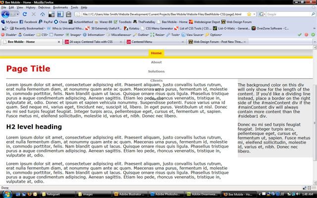
This is the result of my current coding:

cssmenuproblem.jpg


If anyone can shed some light on this problem of mine, I would greatly appreciate it! THANKS!
 

Wickedself

New Member
.twoColLiqRtHdr #navigation {

margin-left: 0; /* Remove this line*/

#navigation ul, #navigation ul li {
list-style: none;
margin: 0; /*And this line*/

I think this will work

But you should have posted your full html so that it would have been easier to understand.
 

alexsmith0913

New Member
Darn.. That didn't work. I'll post my full HTML this time, as well as my updated CSS.

CSS:
Code:
@charset "utf-8";
/* CSS Document */
 
body  {
	font: 100% Verdana, Arial, Helvetica, sans-serif;
	background: #666666;
	margin: 0; 
	padding: 0;
	text-align: center;
	color: #000000;
}
.style2 {
	font-size: x-small;
	color: #999999;
}
.footer {
	font-size: x-small;
	color: #999999;
}
page-title {
	font: 100% Verdana, Arial, Helvetica, sans-serif;
	background: #666666;
	text-align: center;
	color: #000000;
}
.main #container { 
	width: 100%;  /* this will create a container 80% of the browser width */
	background: #FFFFFF;
	margin: 0 auto; /* the auto margins (in conjunction with a width) center the page */
	border: 0px solid #000000;
	text-align: left; /* this overrides the text-align: center on the body element. */
}
.main #topnav { 
	padding: 0 0px; /* this padding matches the left alignment of the elements in the divs that appear above it. */
	background: #DDDDDD;
	border-bottom-width: thin;
	border-bottom-color: #999;
	border-bottom-style: solid;
} 
.main #topnav p {
	margin: 0;
	padding: 10px 0;
}
.main #header {
	background: #FFF;
	text-align: left;
	padding-top: 20px;
	padding-right: 0px;
	padding-bottom: 20px;
	padding-left: 0px;
} 
.main #pagetitle { 
	background: #FFF;
	margin: 0 0% 0 25px;
	border-bottom-color: #333;
	border-bottom-style: solid;
	border-bottom-width: thin;
} 
.main #header h1 {
	margin: 0;
	padding: 10px 0;
}
.main #navigation { 
	height: 37px; 
	background: #FFF url("images/menu-bg-yellow-orig.gif") repeat-x; 
	font-size: .9em; 
	font-family: "Lucida Grande", Verdana, sans-serif; 
	font-weight: bold; 
	padding: 0;
}
.main #navigation ul, #navigation ul li {
     list-style: none;
     padding: 0;
 }
.main #navigation ul {
	height: 37px; 
	margin: 0; 
	padding: 0;
	text-align: center;
} 
.twoColLigRtHdr #navigation ul li {
	display: inline-block;
}
.main #navigation ul li a {
	color: #777;  
	text-decoration: none;
	padding: 2px 10px 0px;
	height: 37px;
	line-height: 200%;
	margin: 0;
	display: inline-block;
}
.main #navigation ul li a:hover { 
	color: #333; 
}
.main #navigation ul li a.current { 
	color: #CC0A00;
	background: #FFF url("images/current-bg-yellow.gif") repeat-x; 
	padding: 2px 10px 0px; 
	display: inline-block;
}
/*\*//*/
.main #navigation ul li a {
	display: inline-block;
	white-space: nowrap;
	width: 1px;
}

.main #navigation ul {
	padding-bottom: 0;
	margin-bottom: -1px;
}
/**/

/*\*/
html .main #navigation ul li a {
	padding: 0;
}
/**/

.main #sidebar1 {
	float: right; /* since this element is floated, a width must be given */
	width: 24%; 
	background: #EBEBEB; /* the background color will be displayed for the length of the content in the column, but no further */
	padding-top: 10px; /* top and bottom padding create visual space within this div  */
}
.main #sidebar1 h3, .main #sidebar1 p {
	margin-left: 0px; /* the left and right margin should be given to every element that will be placed in the side columns */
	margin-right: 10px;
}

/* Tips for mainContent:
1. the space between the mainContent and sidebar1 is created with the right margin on the mainContent div.  No matter how much content the sidebar1 div contains, the column space will remain. You can remove this right margin if you want the #mainContent div's text to fill the #sidebar1 space when the content in #sidebar1 ends.
2. to avoid float drop at a supported minimum 800 x 600 resolution, elements within the mainContent div should be 430px or smaller (this includes images).
3. in the Internet Explorer Conditional Comment below, the zoom property is used to give the mainContent "hasLayout." This avoids several IE-specific bugs.
*/
.main #mainContent { 
	margin: 0 26% 0 25px; /* the left margin should mirror the margin on the header and footer for proper alignment. */
} 

.main #footer { 
	padding: 0 10px; /* this padding matches the left alignment of the elements in the divs that appear above it. */
	background:#DDDDDD;
	border-top: thin;
	border-top-color: #999;
	border-top-style: solid;
} 
.main #footer p {
	margin: 0; /* zeroing the margins of the first element in the footer will avoid the possibility of margin collapse - a space between divs */
	padding: 10px 0; /* padding on this element will create space, just as the the margin would have, without the margin collapse issue */
}

/* Miscellaneous classes for reuse */
.fltrt { /* this class can be used to float an element right in your page. The floated element must precede the element it should be next to on the page. */
	float: right;
	margin-left: 8px;
}
.fltlft { /* this class can be used to float an element left in your page. The floated element must precede the element it should be next to on the page. */
	float: left;
	margin-right: 8px;
}
.clearfloat { /* this class should be placed on a div or break element and should be the final element before the close of a container that should fully contain a float */
	clear:both;
    height:0;
    font-size: 1px;
    line-height: 0px;
}

HTML:
HTML:
<!DOCTYPE html PUBLIC "-//W3C//DTD XHTML 1.0 Transitional//EN" "http://www.w3.org/TR/xhtml1/DTD/xhtml1-transitional.dtd">
<html xmlns="http://www.w3.org/1999/xhtml">
<head>
<meta http-equiv="Content-Type" content="text/html; charset=utf-8" />
<title>Bee Mobile - Home</title>
<link href="styles.css" rel="stylesheet" type="text/css" />
</head>

<body class="main">
<div id="container">  
  <div id="topnav">
    <div align="right" class="style2">Sitemap | Client Login <br /></div></div>
  <div id="header">
  <img src="images/logo_bee_reduced.gif" alt="Bee" align="absbottom" />
  <img src="images/bee_mobile_text_fullsize.jpg" alt="Header Logo" width="50%" height="10%" align="absmiddle" />
  <!-- end #header -->
  </div>
  <div id="navigation">
  	 <ul id="navigation">
   		<li><a href="page1.html" target="_self" title="Home" class="current">Home</a></li>
   		<li><a href="about.html" target="_self" title="About">About</a></li>
   		<li><a href="solutions/solutions.html" target="_self" title="Solutions">Solutions</a></li>
   		<li><a href="clients/clients.html" target="_self" title="Clients">Clients</a></li>
   		<li><a href="faq/faq.html" target="_self" title="FAQ">FAQ</a></li>
   		<li><a href="contact/contact.html" target="_self" title="Contact">Contact</a></li>
    </ul></div>
  <!-- end #navigation -->
   <div id="pagetitle">     
     <h1 align="left" class="style1">Page Title</h1>
   </div>
  <div id="sidebar1">
<p>The background color on this div will only show for the length of the content. If you'd like a dividing line instead, place a border on the right side of the #mainContent div if the #mainContent div will always contain more content than the #sidebar1 div. </p><p> Donec eu mi sed turpis feugiat feugiat. Integer turpis arcu, pellentesque  eget, cursus et, fermentum ut, sapien. Fusce metus mi, eleifend  sollicitudin, molestie id, varius et, nibh. Donec nec libero.   </p>
<!-- end #sidebar1 --></div>
  <div id="mainContent">
  Lorem ipsum dolor sit amet, consectetuer adipiscing elit. Praesent aliquam,  justo convallis luctus rutrum, erat nulla fermentum diam, at nonummy quam  ante ac quam. Maecenas urna purus, fermentum id, molestie in, commodo  porttitor, felis. Nam blandit quam ut lacus. Quisque ornare risus quis  ligula. Phasellus tristique purus a augue condimentum adipiscing. Aenean  sagittis. Etiam leo pede, rhoncus venenatis, tristique in, vulputate at,  odio. Donec et ipsum et sapien vehicula nonummy. Suspendisse potenti. Fusce  varius urna id quam. Sed neque mi, varius eget, tincidunt nec, suscipit id,  libero. In eget purus. Vestibulum ut nisl. Donec eu mi sed turpis feugiat  feugiat. Integer turpis arcu, pellentesque eget, cursus et, fermentum ut,  sapien. Fusce metus mi, eleifend sollicitudin, molestie id, varius et, nibh.  Donec nec libero.
    <h2>H2 level heading </h2>
    <p>Lorem ipsum dolor sit amet, consectetuer adipiscing elit. Praesent aliquam,  justo convallis luctus rutrum, erat nulla fermentum diam, at nonummy quam  ante ac quam. Maecenas urna purus, fermentum id, molestie in, commodo  porttitor, felis. Nam blandit quam ut lacus. Quisque ornare risus quis  ligula. Phasellus tristique purus a augue condimentum adipiscing. Aenean  sagittis. Etiam leo pede, rhoncus venenatis, tristique in, vulputate at, odio.
  <!-- end #mainContent -->
    </p>
    <p>Lorem ipsum dolor sit amet, consectetuer adipiscing elit. Praesent aliquam,  justo convallis luctus rutrum, erat nulla fermentum diam, at nonummy quam  ante ac quam. Maecenas urna purus, fermentum id, molestie in, commodo  porttitor, felis. Nam blandit quam ut lacus. Quisque ornare risus quis  ligula. Phasellus tristique purus a augue condimentum adipiscing. Aenean  sagittis. Etiam leo pede, rhoncus venenatis, tristique in, vulputate at, odio. </p>
  </div>
	<!-- This clearing element should immediately follow the #mainContent div in order to force the #container div to contain all child floats --><br class="clearfloat" />
  <div id="footer">
    <div align="center" class="footer">Copyright © 2009 Bee Mobile, LLC. All rights reserved.<br />
    Contact | Sitemap | About</div>
  <!-- end #footer --></div>
<!-- end #container --></div>
</body>
</html>

Thanks again!
 

PixelPusher

Super Moderator
Staff member
For starters, welcome to WDF!

Now onto your code. Right off the back I noticed a couple issues.

1.) ID names. There can only be one unique id name per page. You have two elements with the id name "navigation".

2.) A list (ul) is a block level element and so is a division (div). In most cases there is no reason to wrap a ul in a div.

3.) To get an element to center on a page you can use the auto setting for left and right margins. Just make sure a width is specified.
 
Top