You are using an out of date browser. It may not display this or other websites correctly.
You should upgrade or use an alternative browser.
You should upgrade or use an alternative browser.
Best website design
- Thread starter webhost2
- Start date

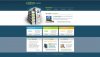
I like 2 the best, the only thing I notice off is that the numbers in the menu are cut off on the bottom.
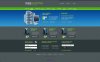
I actually would like the header design in 1 better, except way too much bright lime color for my taste. Personally I think it would probably look great in blue or red. There probably are some people whom will like the green the way it though.
I like the menu in option two the best, aside from the above mentioned issue.
Last edited:
webmaster705
New Member
I like 2nd one more than 1st design.
oldgamesware
New Member
Like the number 2 best. Its colors are not so bright for the eyes and its cool to look at.
infobroker
New Member
There has NEVER been a program like this with such an amazing earning potential!
Hi!
Wouldn't you love to be a part of a program where the products automatically
advertise your affiliate link, even if you're not advertising that particular program?
At the NPN they have an amazing URL redirector product that will build your
downline 'in the background' while you advertise whatever you want. It really works!
With a product that works and a payplan that earns, you have the complete and
ultimate combination! Check it out!
Here's my link:
http://globalnpn.com/caps/c3/101207/
http://thenpn.biz/?id=101207
Capture Page:
http://globalnpn.com/caps/c3/101207/
Capture Page:
http://thenpn.biz/ar/1/101207/
http://thenpn.biz/ar/2/101207/
Splash Page(HD Video Tour):
http://globalnpn.com/caps/tour1/101207/
Capture Page(traffic exchange):
http://globalnpn.com/caps/c3/101207/
Thanks, have fun!