Altered Media Layout Concept

zkiller

Super Moderator
Staff member
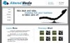
I have been tinkering around with ideas as to what i want my business site to look like and this is the first concept.

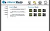
i am not at all happy with it. for one, it's too pale and i don't like the cartoon-ish icons mixed with the more clean cut logo. the original idea behind the icons was that i didn't want to take myself to seriously, but i feel it backfired on me.

i wasn't sure whether i wanted to post this or not, but i figured it never hurt to hear the ideas and criticism of others.

anyways... here it is.
 

Attachments

  • altered-media-concept001.jpg
    altered-media-concept001.jpg
    71.4 KB · Views: 98

zkiller

Super Moderator
Staff member
here is some cheese to go with the above shown wine...
 

Attachments

  • altered-media-concept002.jpg
    altered-media-concept002.jpg
    89.9 KB · Views: 99

ian

Administrator
Staff member
Looks great so far, only thing I can comment on is make sure, it has a good balance of text and graphics so that the page loads fast, and is search friendly.
 

DLPerry

New Member
I like it, but the navigation icons do look a bit weak in relation to the rest of the design. I'm not sure how to define it exactly - they look a bit '3rd party stock' perhaps....like an afterthought... I dunno...talkin outta my head and not being much help.

It's a draft, so it's not important yet, but be sure and quadruple check spelling, grammar, punctuation, etc. To me anyway, the term 'internet presents' does not read right - should it be 'internet presence'?

But IMHO, the layout, whitespace, colors, etc. are nice - with cheese please. :)
 
Last edited:

zkiller

Super Moderator
Staff member
thanks for the kind comments. i am surprised that everyone likes it. i think it has potential, but i am not entirely sure how to bring it out yet. in it's current state, i am not really feeling it. but, as dlperry pointed out, it's just a draft, so no worries.

@ dlperry - i know i am bad when it comes to grammar and punctuation most of the time. not something i really ever cared to spend to much time with. but yes, i will be triple checking everything before the site goes live, as i do value the image the site portrays very highly.

as mentioned above, i agree that the icons are very much out of place. i am not sure how i am gonna fix that yet though. any ideas?

PS: i need a vacation!!!
 

zkiller

Super Moderator
Staff member
i think i am getting warmer, or not?
 

Attachments

  • altered-media-concept003.jpg
    altered-media-concept003.jpg
    92.4 KB · Views: 76
Last edited:

zkiller

Super Moderator
Staff member
cleaned the edges on the large box next to the nav box and lightened up the background/gradient a bit.
 

Attachments

  • altered-media-concept004.jpg
    altered-media-concept004.jpg
    91.4 KB · Views: 76

DLPerry

New Member
Very nice. IMHO the navigation looks much more in sync with the overall design now :)

I'm on the fence about the gradient change. Purely from a visual standpoint - when I look at the 2 versions individually - the darker gradient seems to have more 'punch', or is more attention getting - to me anyway. It depends on what effect you want I guess - to make that area more or less prominent during the first 5-10 seconds of viewing.
I'm wondering what the effect would be if you matched the gradient to the gray color (#6E6E6E) that is left and right of the main content
 
Last edited:

zkiller

Super Moderator
Staff member
honestly, i feel the darker gradient is to obtrusive. i don't want the graphical element of the site to the users main focus and i think the lighter gradient is easier on the eyes.

btw, here is a somewhat functional draft of the last concept...

http://www.alteredmedia.net/index.asp

it is my first go at using css for layout/positioning purposes, but i still have a table in their as well. :p it's been kind of pain getting used to it, but i think i like it.

the only minor detail that is bugging me is the gray 1 pixel line on the right side that doesn't want to go away. lol

let me know what you think so far, good or bad. i am pretty happy with it overall. :)
 

ian

Administrator
Staff member
I like it, apart from the lack of text.
Yeah I know what you mean by the grey one pixel line on the right hand side.
 

zkiller

Super Moderator
Staff member
yeah the nav thingy is ..much better now, rollovers etc? or just plain?
rollovers... check the link in my last post. ;)

I like it, apart from the lack of text.
Yeah I know what you mean by the grey one pixel line on the right hand side.
the text won't be images in the final release. it still has a long ways to go.

what was the load time like?
 

jmad

New Member
i like it the layout is nice. i agree with u on the lighter gradient. the load time wasnt bad but i have high speed. i too i am learning css i am going to have a friend of mine help me out with it (he is pretty good at it.) cause i keep having issues.
 

zkiller

Super Moderator
Staff member
i am on cable myself, so it is hard to judge what the load time is like for those less fortunate.

i am not really new to css. i have been using it for a few years now in fact. just never for positioning and so forth. i figured i would give it a try to help clean up my code a bit. i have a few projects down the road that will greatly benefit from it. this is kind of like my trial and error phase. i am leaning towards a mixture of dhtml and asp.net for future projects. the cleaner the code... the easier it will be to add features and eliminate potential security threats.

update:
- fixed some css issues. the site should center on the screen in IE now as well.
- added second background layer.
- got rid of the 1 pixel gray line on the right side.

progress is being made slowly - only have a few minutes a day to work on it right now. i think next will need to be some form of footer.

lol... i just noticed portfolio is misspelled.
 
Last edited:

zkiller

Super Moderator
Staff member
today was the first time i actually got the chance to sit due anything in a good while.

instead of continuing work on the last concept, i decided to play around with some other ideas. i am not sure if i really thought this one threw... lol

it's all good though, no hurry. ;)
 

Attachments

  • altered-media-concept005.jpg
    altered-media-concept005.jpg
    28.1 KB · Views: 26

zkiller

Super Moderator
Staff member
thanks. :)

did you mean the last design concept on page 1 of this thread or the one on this page?
 
Top