New company logo

RoboticPro

New Member
Hello,

I'm currently redesigning my website + logo to make it a bit personal,
I have a one person business in webdesign and computers (network, pc's, service etc.)
And as for my logo I designed this:
http://briansservice.nl/logos/

The first one is just plain and simple.
The second one is more in a Pixel font because I like retro games and console's (a bit more personal)
and it adds to the computer part.

It's simple and clean, so if you could give me your opinion or any tips to improve then that would be great.

Brian van der Horst
 

lookingahead

New Member
I'd choose the 2nd one because it adds a little definition to your business. A little bit of a personal touch as well as makes you stand out against other businesses.
 

doug_eike

New Member
The idea of #2 seems to fit better with your personality, but frankly, I'm not wild about either one. Of course, the sizing will affect the result, but your name jumps out a bit too much, and fade to the right makes it hard to read quickly. You want a quick, positive impression that is appropriate and memorable. You might want to rethink the green and the fade. A fade from top to bottom might be more effective than from left to right.
 

Backseat

New Member
If those are the options, I'd definately go with number two but I really don't like the fact that you're saying

BRIAN's computerservice

It should be the other way around imho... The most important thing is that you're a computer service, not that you're brian.
 

Fireproofgfx

New Member
To be honest I don't like either of them. Its to "simple" and the colors, though they work together, don't look good at all.

When I make Text logos I tend to always make one text Bold and a little closer together and the other thinner and little more spread out. It helps your eyes to differentiate between the two words beside the color differences.

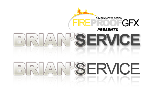
Here is a concept I came up with, I think you should consider. I think this way better deals with the Double S S between the words and combines them in a stylish way.

briansservice_logo_concept_by_fireproofgfx-d4lips8.png
 

leroy30

New Member
Sorry to say but I don't like either. The colour is dull and makes me thing "old" and I'm having a hard time understanding why you coloured the 's the same as service. What is the connection between 's and service?

Here's an idea. How about calling your company bIT. Then you'd have a nice short name people could remember, people can understand what you do (at least guess from IT), 'b' stands for Brian and "bit" is the smallest building block of computers. Heaps of symbolism in just three letters!

Just an idea.
 

d a v e

New Member
Sorry to say but I don't like either. The colour is dull and makes me thing "old" and I'm having a hard time understanding why you coloured the 's the same as service. What is the connection between 's and service?

Here's an idea. How about calling your company bIT. Then you'd have a nice short name people could remember, people can understand what you do (at least guess from IT), 'b' stands for Brian and "bit" is the smallest building block of computers. Heaps of symbolism in just three letters!

Just an idea.

that's a great idea! (as is Fireproofgfx')
 

ericburton

New Member
Resources like the web and graphic design you have mentioned here will be very useful to all! I will post a link to this page on my website. Thank you for dropping that link, however.
 

printchesco

New Member
I think that it needs a bit of work, but number two is definitely better. Numbe one is really nothing special; in fact, it's pretty boring and forgettable. What really gave number two the edge is the way you made it look pixellated because that's the only indication customers will have of what your business actually is.
 
Top