my first attempt at a website

Gizo

New Member
I am teaching myself how to design and build websites using a couple of books and lots of web tutorials. this is my first attempt it does not have any flash or java, it is for the Caravan park I am the manager of, our current website is looking pretty dated and the web designer who built it does not impress me with his work, so I thought I would have a go myself.
I do not have this site published yet so I have a jpeg.
 

Attachments

  • mockup.jpg
    mockup.jpg
    89.1 KB · Views: 57

DHDdirect

New Member
Hello Gizo

It's not too bad for a start. Ron made some suggestions on your other post to spruce it up a bit which I would agree with.

If I was to make other suggestions for your business is to have a park layout and detail any and all features of your park such as hook-ups, dumps, tv, internet, dog friendly, groceries, repair items etc. Even if you don't think it's important to mention it may be important to someone else

Also hours of operation and when are good times to call if it's different then operating hours.

When my wife and I was travelling around it was a necessity to know certain things when we were looking for a place to stay. Remember with any website content is key. The more relative content you put on your site the better.

* it also wouldn't be a bad idea to list whats in the nearest town/s.. grocery stores, mechanics, auto parts, restaurants etc

** there is just too much to mention :) then after you get your site squared away, get listed on google places and take advantage of other google services such as google analytics, and google webmaster tools. All of which are free services.
 
Last edited:

notarypublic

New Member
For a first attempt this is very impressive, but here are a few critique points:

* Consider left-aligning navigation bar, main content text: Generally speaking, left-aligned text is easier to read and looks more professional.

* Use more consistent fonts: For your banner and navigation bar, you're using a sans-serif font, for the main content you're using the default times new roman. Also, think about font color; black on grey is not a very high contrast and can have usability problems. Not as big of a concern though - if the color scheme fits the style of your website, then it should be fine.

* Change the link colors: The blue and purple default link colors don't work very well with your overall color scheme.
 

reverseengineer

New Member
The layout looks good and practical, I like the variety of pics beneath the header. My suggestion is to make a more appealing title. Choose a better color other than black and mess with the fonts. I think a font that has a more "script" kind of feel will look better.
 

rickidoo

New Member
1. Love the pictures. I like how you used a large, dominating photo, yet followed up with smaller pictures. Together, they say more than words can express about what the park offers. They are very compelling.

2. The menu items are easy to read. This is a bonus for your senior citizen customers.

3. The "all centered text" block of text in the main body area should not be... lots of centered text, although it looks "balanced" when viewed at a quick glance, imposes a burden on readers, who now must scan down and to the right when starting a new line. Professional designers would not do this; you can show them your stuff by left aligning the text! And put some "white space" breathing room (margins) on either side of the text.

4. Designing a webpage should include designing it for the search engines, too. This is actually some of the skills a good web designer brings to the table. And its a critical skill in the business of parks. Some tips:

a. I can't tell if your left side menu items are all graphics or text. If they are all graphics, you will be dinged in the search engines unless you compensate with text links somewhere else, perhaps in the footer.

b. Every page should have a page title in the body area, and surrounded by "h1" tags. Whatever program you are using should have a selector for heading tags. There should be only h1-wrapped title on a page. The search engines pay a lot of attention to h1 wrapped titles, so try to craft it to speak to your human audience AND speak to a phrase that will index well.

BTW, having the "text" on the graphic header doesn't count in this regard.

Post your page somewhere it can be reached instead of a graphic; a lot more can be reviewed that way.

Rick Dieffenbach
 

d a v e

New Member
The header text is too close to the top of the page
mention where it is (where is palm beach?) at the top where it's easy to see along with either a contact link or the information itself if it's simple (i.e. tel. number)

ditto: textv should be left aligned and also needs more space around it

menu is a bit on the large side and lok into using a css styled list for your navigation (something like http://css.maxdesign.com.au/listamatic/ or similar)

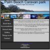
you have nce photos but why is the site so dark and colourless? is this a reflection of the park? i doubt it :) don't make it as colourful as the parrot in the first image but find some suitable colours - maybe the sand and blue from the ocean/sea - white background with a light sand side bar for example or blue sidebar (navigation) and sandy footer ;)

you could do with a logo - i know a guy that makes them :)

doesn't St Georges basin have an apostrophe in it?

DHDdirect makes some good points about what users want to see - talk to some caravanners and see what they look for in a site.

also list your top 3-5 selling points at the top of the page before your intro text
the borders are a bit heavy and makes everything look boxy - and i hope you're not going to use tables for layout

have your call to action i.e. book now as a clickable button top right so it's easy for people to act on the information when they've made up their minds

have some testimonials

a good start but would welcome a (good) designer's touch ;)
 

omglookitsagoat

New Member
I think some color could spice it up a little if you find a good color scheme. you could experiment with different colors in photoshop or illustrator if you have those until you find a good color scheme that works. It would be a nice touch if you could have some rollover color changes for your navigation. Nice job for a first website.

I think it might also help make it look more interesting to use a different font for the banner at the top, but make sure it suits your company and isn't just chosen because it's flashy. If you have a logo, you could put that up in the top right corner next to the title text.
 
Top