Design Critique

DesigNes

New Member
Boring.

But it's simple, easy to read & navigate.
I wouldn't stress too much about the lack of interest, it's not a website topic that needs wild design.
 

notarypublic

New Member
Since it's not a commercial site, the emphasis is on being easy to use (especially for an older population). You should see how awful the original site is, that this is replacing ;)

The 'boring' is something I need to break away from, though. I'm trying to find help/good tutorials learning inDesign, so that I can start working on vector art/creating textures.

Leaps and bounds :)
 

DesigNes

New Member
eewwwww! lol

I would do something more like this, simple but a little more visually interesting
untitled.png


I'd change to another menu too.

If you're going to specifically target senors I would make the text even larger & keep the contrast high like you have :cool:
 

Phreaddee

Super Moderator
Staff member
all good points.
remember a lot of the elderly are using ie6!
definately make the slideshow smaller and the content box a bit more prominent near the top.
the menu I think is fine, but could be snazzed up a bit. maybe add some colour to the body BG. you're on the right track tho with your target market, but it can certainly be made slightly less "boring" ...
 

JackRT

New Member
May I suggest a template? flash-mint or templatemonster would have great templates you can use... just change the pictures, logo, etc... rather than trying to create a site from scratch...
 

ronaldroe

Super Moderator
Staff member
May I suggest a template? flash-mint or templatemonster would have great templates you can use... just change the pictures, logo, etc... rather than trying to create a site from scratch...

I have even better advice: Completely disregard this advice. Based on the assumption that this for a is a client, what client would be pleased with a designer who simply grabbed someone else's work, claimed it as their own, and charged them for it? People who do lazy crap like that are becoming a huge problem. Laziness...
 

krymson

Member
The world does not revolve around people using templates, it people who are wanna be designers and developers that clutter up this business and drag it down... We're fighting a war with people who are wanting to make a quick buck but know nothing about what they're doing. GOD!!!! This is why i crated "The "D" Spot" to get away from people like that and is a safe haven for the REAL designers and developers and monitor people who like to spam and say idiotic stuff like that
 

krymson

Member
About the actual thread it's self the site is coming together nicely, im not too sure about that nav. I would make the nav text a bit bigger and just have an underline rollover effect keep it simple and easy if this site is for the elderly, it needs to be a "minimalist" website for simplicity and easy UI. Otherwise bang up job sir.
 

Phreaddee

Super Moderator
Staff member
agreed on the template thing, its been 8 long years since I last used one, and I can say that makes me very happy.

Apart from the fact the majority of templates are horrendously designed, built and created. they all also have no creativity or originality.

A web designer that uses templates ain't really a web designer in my eyes, just a fn poser who doesnt know what he's doing.

as for the suggestion to use a templatemonster template, I'd suggest that notary would be removing at least 90% of the template rubbish (even on a minimalist one) just to even get it at a point to begin, and why would he need it?, it is already a decent coded website, just needs a few design tweaks.

I still think the slideshow could be made smaller. its really too large on 1024x768.
I do like the fade-ins tho on the content - very tasty.
 

notarypublic

New Member
I do like the fade-ins tho on the content - very tasty.
Thanks, I'm rather pleased to say I wrote a small script for that without having to look at someone else's tutorial first. Rather than hide the content with CSS (which would hurt SEO for such a large block of text), the script hides the text with JS and then slowly reveals it again. Only a few lines of code, and nothing terribly unique, but it's the little things that make the difference :)

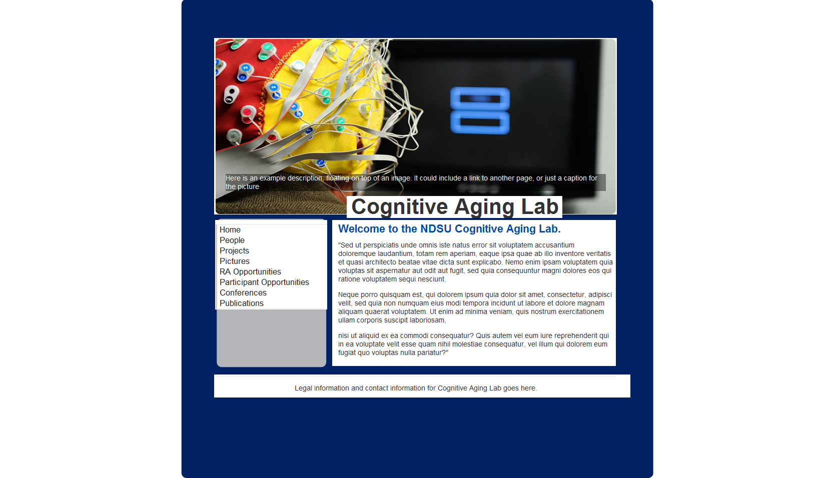
I'll adjust the slideshow, definitely. A bit concerned with making it smaller and making the text bigger, though - Some of the pages have a lot of text, and it wouldn't look very good at all.

Any ideas on the navigation bar? It doesn't seem to be getting much love :D I think the site could benefit from some visible borders separating areas of content from each other, but nothing that I've tried looks right. It's a color issue, and I've already established that that is one of my weak points..

Also, this site is only expecting traffic of a few hundred hits per year I would say. I'm going out of my way to put this much effort into it, as a personal challenge ;) And I'll keep working on it until it looks portfolio-worthy.

Thanks for the feedback! And Jack.. just stop. Stop and think about what you've done.
 

JackRT

New Member
I have even better advice: Completely disregard this advice. Based on the assumption that this for a is a client, what client would be pleased with a designer who simply grabbed someone else's work, claimed it as their own, and charged them for it? People who do lazy crap like that are becoming a huge problem. Laziness...

How did you come up with the idea that it's for a client? Please clarify.
 

ronaldroe

Super Moderator
Staff member
How did you come up with the idea that it's for a client? Please clarify.

Did you read the thread? The OP linked to the client's old site to show the contrast between it an his design. Not to mention, you usually don't just randomly design a website for a fictional cognitive aging lab. And even if that's the case, the takeaway here is that using templates isn't design. It's making a quick buck off someone else's work.
 

leroy30

New Member
Really clean and crisp! I like it.

Maybe some padding around that title at the top so it's not so squashed? And some invisibile padding around the menu buttons so they aren't so narrow to hover over (height wise there is some dead space inbetween that could be roll-over).

Looks like your target market is elderly people? Perhaps up the text size so they can read it :)
 

JackRT

New Member
Did you read the thread? The OP linked to the client's old site to show the contrast between it an his design. Not to mention, you usually don't just randomly design a website for a fictional cognitive aging lab. And even if that's the case, the takeaway here is that using templates isn't design. It's making a quick buck off someone else's work.

I did read it... and read it again... there's no post where he says it's a "client"... when I was a student, I did re-design the site of a dept I was a part of... so it's not necessarily a client when you work on a website... not that it matters, let's not drag this too long. I am not a webdesigner by profession... but my bacgkground is CS... therefore, I rather use a template to create a nice site than working on every single thing from scratch... you may call it laziness, and it very much IS laziness for a webdesigner, but for me it's leaving the hard stuff to professionals and taking care of the smaller details.
 

notarypublic

New Member
I am not a webdesigner by profession... but my bacgkground is CS... therefore, I rather use a template to create a nice site than working on every single thing from scratch... you may call it laziness, and it very much IS laziness for a webdesigner, but for me it's leaving the hard stuff to professionals and taking care of the smaller details.
Whew. Good thing this isn't a forum for web design or something.

...oh wait.
 
Top